My brother and I then made bar graphs to show the results of the surveys.
We sorted the responses into groups and, using tally marks, worked how many were in each group.
Here is the first survey. The question was: How is post delivered to your home?
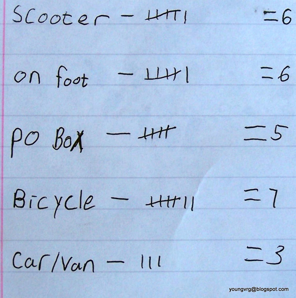 |
| Tally marks to show our findings |
 |
| Our findings in a bar graph |
It was very interesting to see how people get their post delivered. PO Box was used by friends who don't get post delivered to their house.
The second survey question was: What is your favourite season?
(Where someone chose 2 seasons, we counted the first one they mentioned)
 |
| Tallying up the favourite seasons |
 |
| The final results in a bar graph. |
It was quite fun doing this because we were learning about bar graphs and I got to make some of my own.
No comments:
Post a Comment